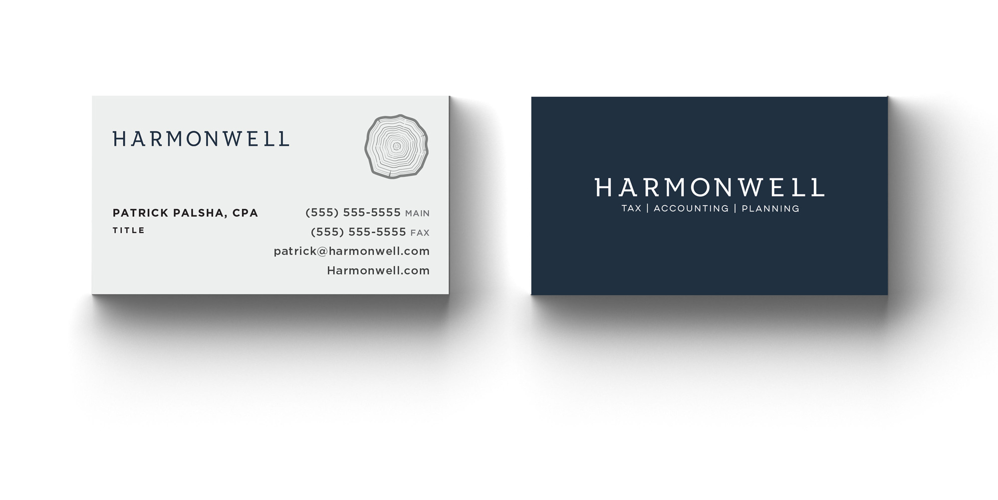
Harmonwell is an accounting firm located in the Pacific Northwest. They specialize in small businesses, tax planning, and financial planning. With the future in mind, they created one of the first subscription-based accounting services. We created a custom typeface that was professional, yet friendly and relatable – fighting the notion that financial businesses are sterile and devoid of personality.
Project
Harmonwell
Industry
Financial
Scope of work
Visual Identity
Collateral
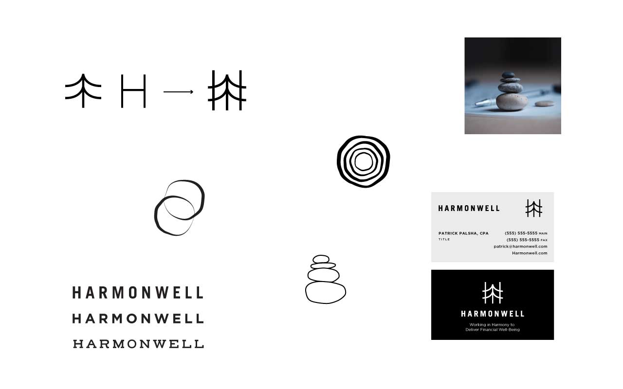
Initial Concepts
Financial Well-Being
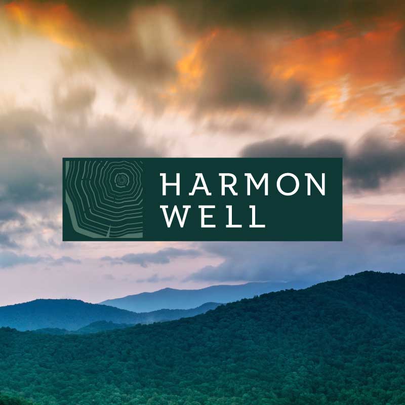
Harmonwell’s tagline, “Working in Harmony to Deliver Financial Well-Being, ” was the initial inspiration. The client also wanted to pull from the Pacific Northwest’s natural beauty, specifically trees. The tree rings circle around the wordmark, signifying a wholeness, unity, and community.


Winter Night
Evergreen
Sunset
Charcoal
Arvo
Aa
A B C D E F G H I J K L M N O P Q R S T U V W X Y Z
a b c d e f g h i j k l m n o p q r s t u v w x y z
Open Sans
Aa
A B C D E F G H I J K L M N O P Q R S T U V W X Y Z
a b c d e f g h i j k l m n o p q r s t u v w x y z